 Purchase the book HERE. Available in hardcover and paperback. The paperback version of the book with comic book cover can be purchased directly from us and signed by Darlene for $12.00 by writing to us HERE. (includes shipping/USA only)  Author Joe Lacey, graphic designer of A Woman's Guide to Low Self-Esteem. May 19, 2023  When I designed A Woman's Guide to Low Self-Esteem, my goal was to make it as visually interesting and sharply witty as the writing. Darlene Lacey made that easy. I may be biased, but I think I can objectively say "this book is really funny!" Almost everything in this book is factual–making it funny and horrifying at the same time. This was not the easiest book to design. There was an enormous amount of digital restoration, original art, and complex page layouts. My goal was to make the book, with its eclectic collection of images, feel as if they all belonged together. I'm biased, but I think I did that! DESIGNING THE COVER  Original cover and new cover for "A Woman's Guide to Low Self-Esteem" The first design for the paperback cover was done in a comic book style which I illustrated. Darlene is depicted trapped in a hallway of advertisements with negative and conflicting messages flying out at her. A few years later, when we decided to publish a hardcover version of the book, I thought it would be a good idea to redesign the cover in a more vintage style. Once that choice was made, we also updated the paperback cover as well. The paperback version of the book with comic book cover can be purchased directly from us and signed by Darlene for $12.00 by writing to us HERE. (includes shipping/USA only)  Cover layout using Adobe Photoshop  The new cover is a parody of the book cover for Four-Party Line. I wanted my cover to have a retro feel to match the look of the interior pages and have a more universal appeal. A Woman's Guide to Low Self-Esteem is written from Darlene's point of view, but it's really written for everyone. I think the new cover gets that message across. The five heads of the women surrounded by perfume, flowers, broken mirrors, a crying eye, nail polish, tampons.... all the fun stuff in life, make it more personal for the reader. The hardcover edition is a bit larger with some slight design updates.  DESIGNING THE INTERIOR PAGES  The interior design was quite challenging. There were many different styles and time periods to work with. Keeping everything looking cohesive was definitely my goal. The visuals go hand-in-hand with the text, acting as equal partners to expose "the 'smoking gun' as to how women's advertising has messed with their minds for over 100 years." It's a melding of vintage advertising, stock images, and custom art & photography, all digitally modeled and designed to work together as if they came from the same hand.   Book layout using Adobe InDesign I spent countless hours digitally resorting (sometimes totally rebuilding) vintage advertisements to work with my own artwork and stock images. Anyone familiar with the descreening process for printing knows that is is not always a fun task. I wanted every image to look great, despite the original source quality. Often, I would remove all tonal screens by hand and repaint them in order to get the image to a new reproduction quality. There are several instances in which I totally redrew and repainted the entire vintage image when the quality of the source material was so low. You'll see an example of this on sample page 11 for the Mark Eden Bustline Developer. I removed all the large dot pattern screening used for newspaper printing from the large image of Sandra Wilder and carefully airbrushed over her in order to get a new print-quality image.  
  DESIGNING THE CHAPTER ELEMENTS Each of the eight chapters has its own graphic title and patterned background. They are a mix of my custom art and stock imagery. The titles are meant to convey "this chapter is going to be fun!" On the surface, these titles can seem quite irreverent, but that is far from reality. Many people who have read the book found it to be inspirational and highly supportive of all people. And did I mention it's really funny?  Here's a couple of the title pages with patterned backgrounds. I like the subtlety of "Finishing School" with its dignity and diplomas mixed in with feminine hygiene products.  Many times I was faced with the need to create my own illustrations. Most often it was the need for something unique that just didn't work with stock images. Here's a few of them.  Throughout the book, there are recurring elements such as Horrifying Quotes, Expert Advice, Questionnaires, and the obnoxious advice of Etta Kitt. I gave each of these sections their own look.  Purchase the book HERE. Available in hardcover and paperback. The paperback version of the book with comic book cover can be purchased directly from us and signed by Darlene for $12.00 by writing to us HERE. (includes shipping/USA only) 
0 Comments
|
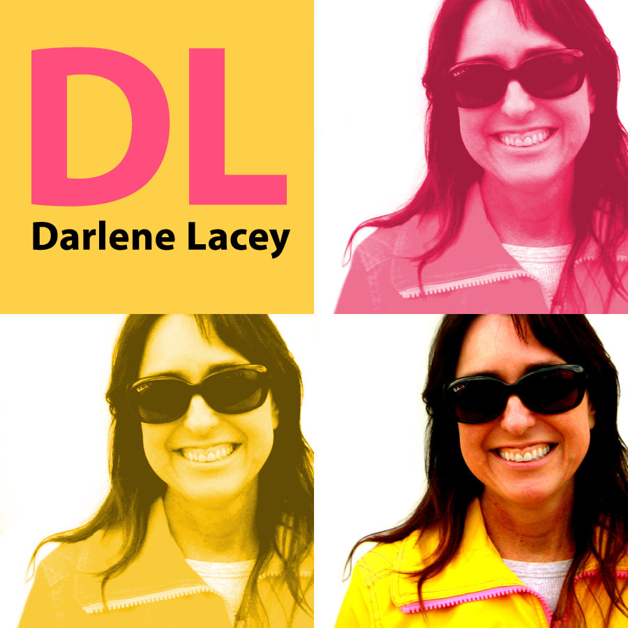
DARLENE LACEY
Darlene Lacey writes about the past with a sharp lens on what it means to us today. She is the author of books and articles about America’s (almost) forgotten history. Her wit and insights have made her a popular interview source. She remembers the past and is not afraid to share it! CATEGORIES
All
LINKS
Goodreads ARCHIVES
|


 RSS Feed